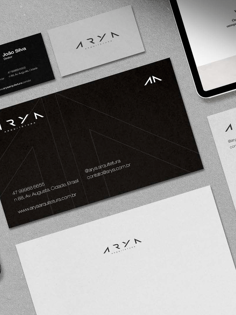

Branding
_
BR
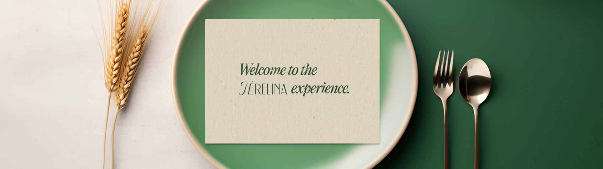
Terelina - Uma Fusão Brasileira e Italiana na Alta Gastronomia
É com grande satisfação que apresentamos nosso projeto de branding para o Terelina, um restaurante ítalo-brasileiro que em breve abrirá suas portas em Lisboa. O nome "Terelina" é uma homenagem às avós dos sócios, representando a essência familiar e a tradição culinária que estão no cerne desse empreendimento.
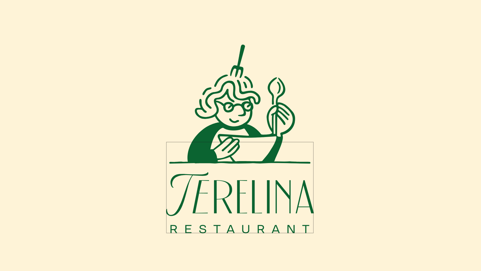
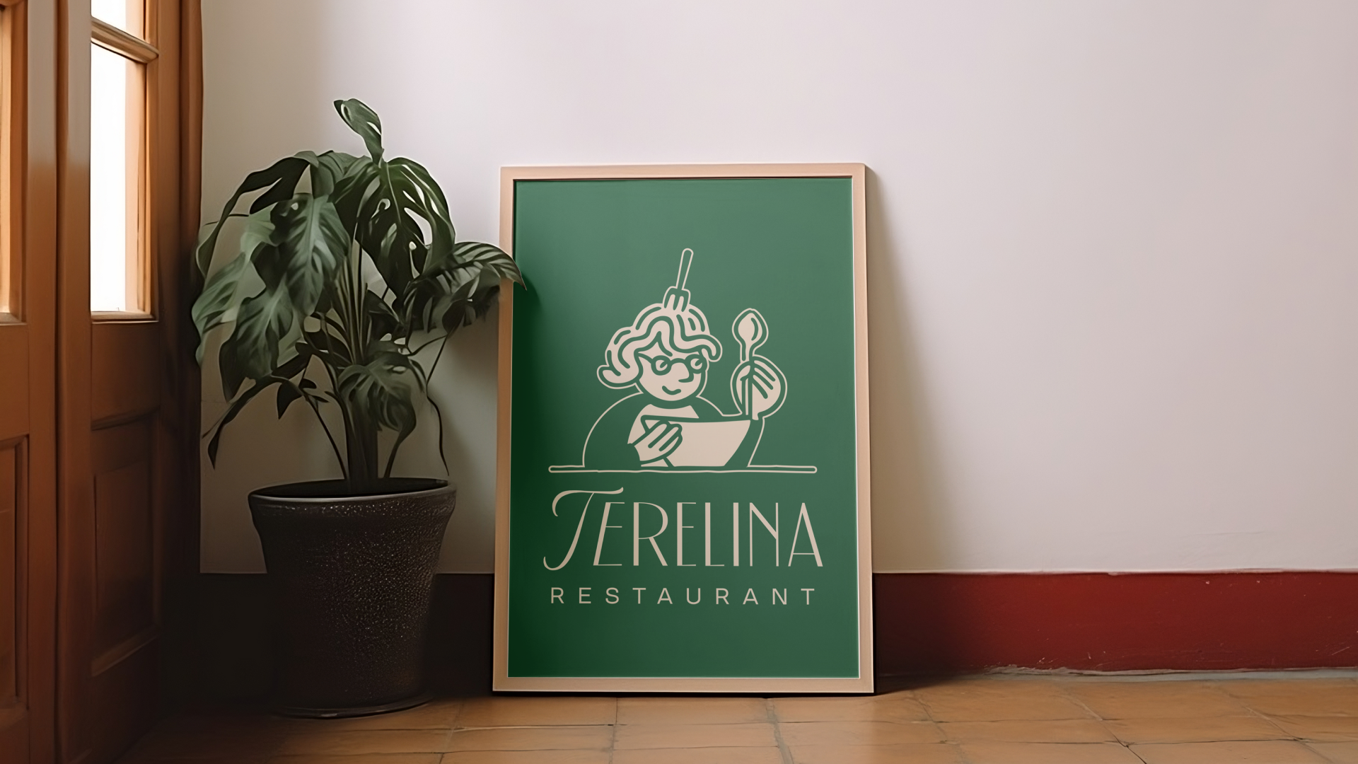
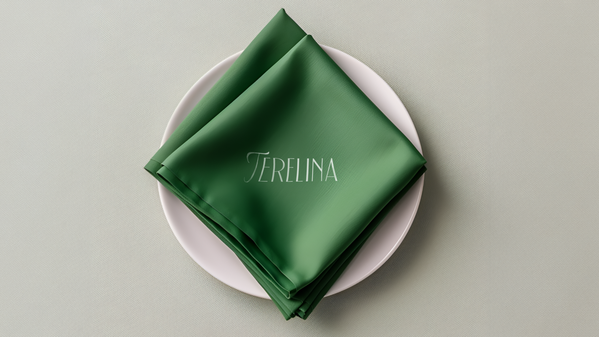
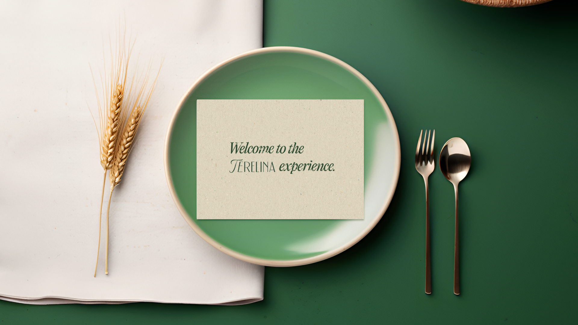
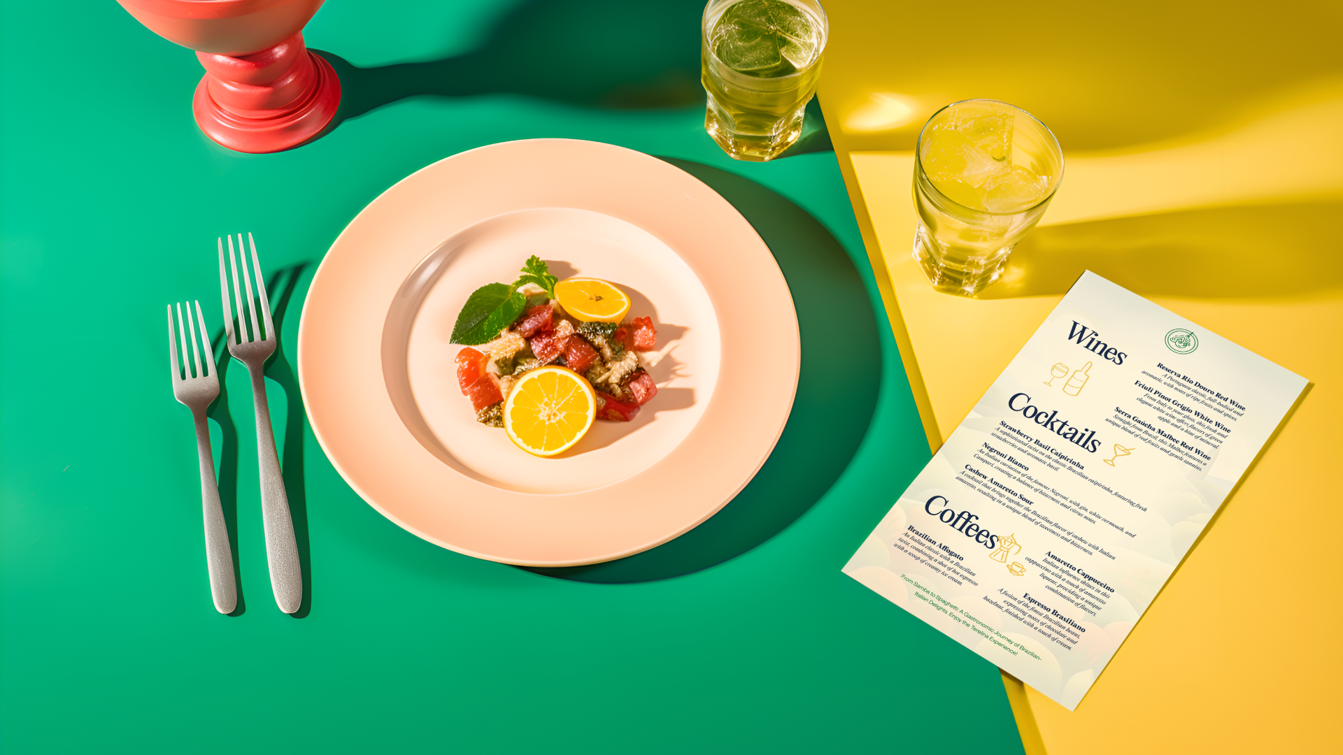
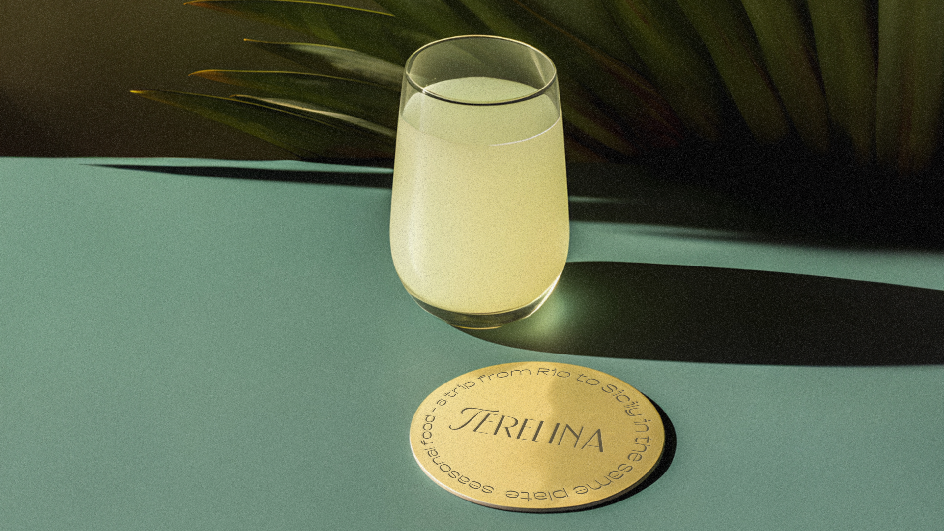
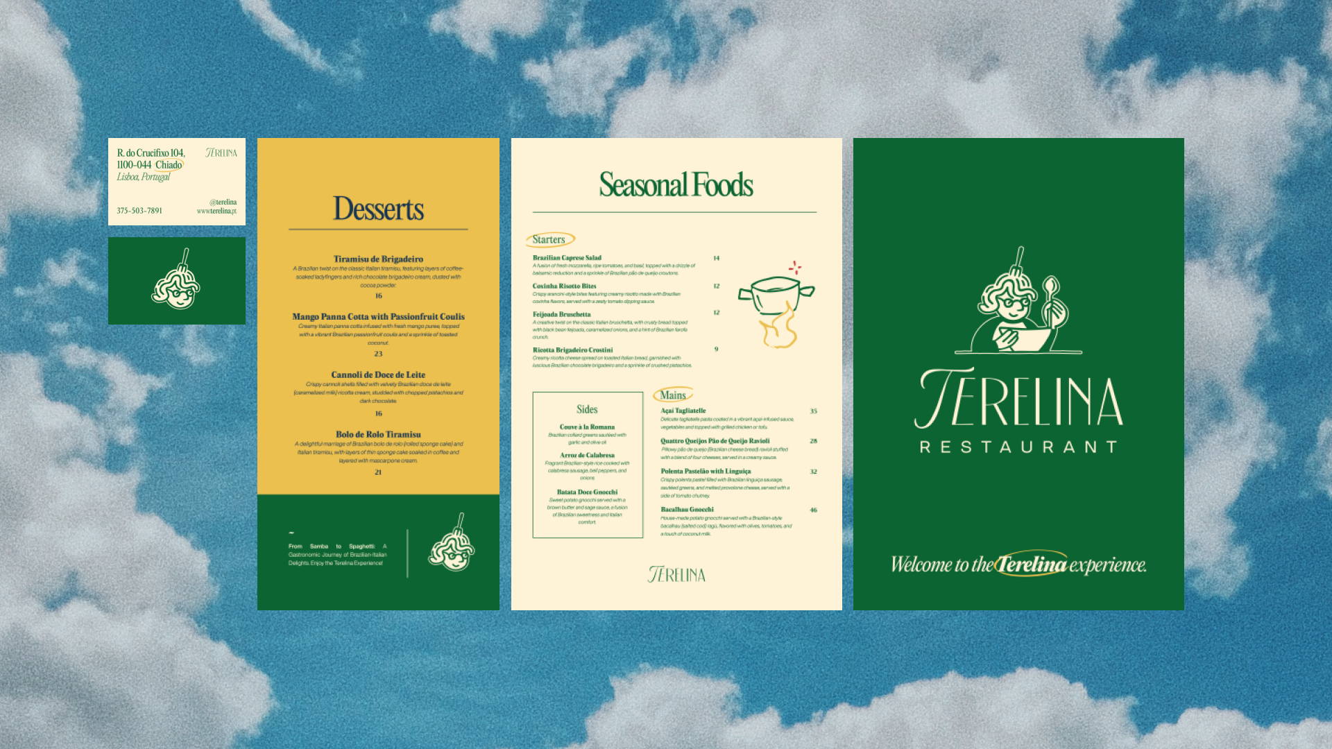
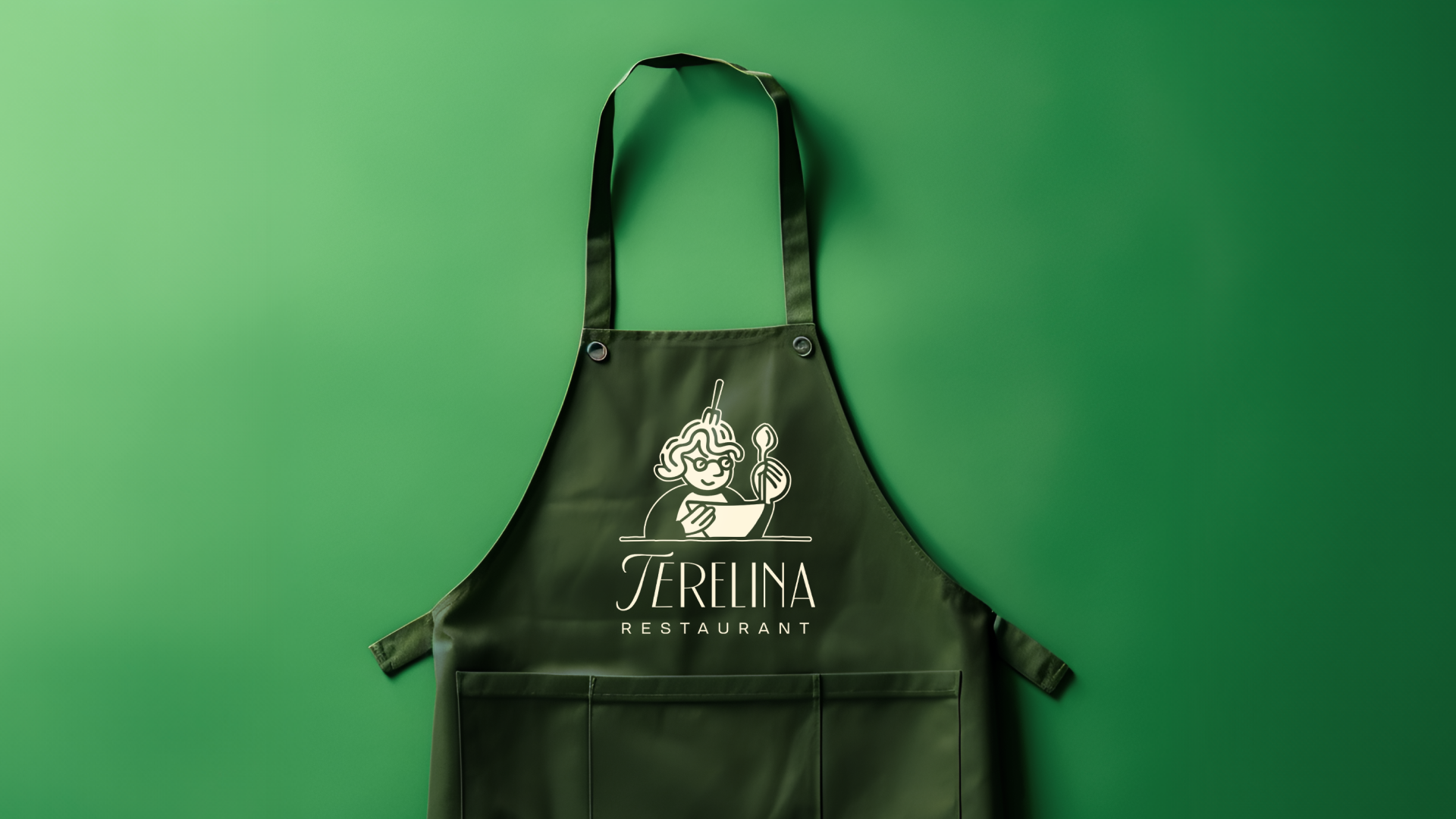
As cores escolhidas para compor a identidade visual deste projeto foram puxadas para os tons pastéis, e que representasse as duas nações referenciadas. De um lado, o amarelo, verde e azul, representando a diversidade brasileira, do outro, o vermelho, branco e verde capturando a essência tradicional italiana. O tom de bege off-white compõe maior parte da identidade visual da Terelina.
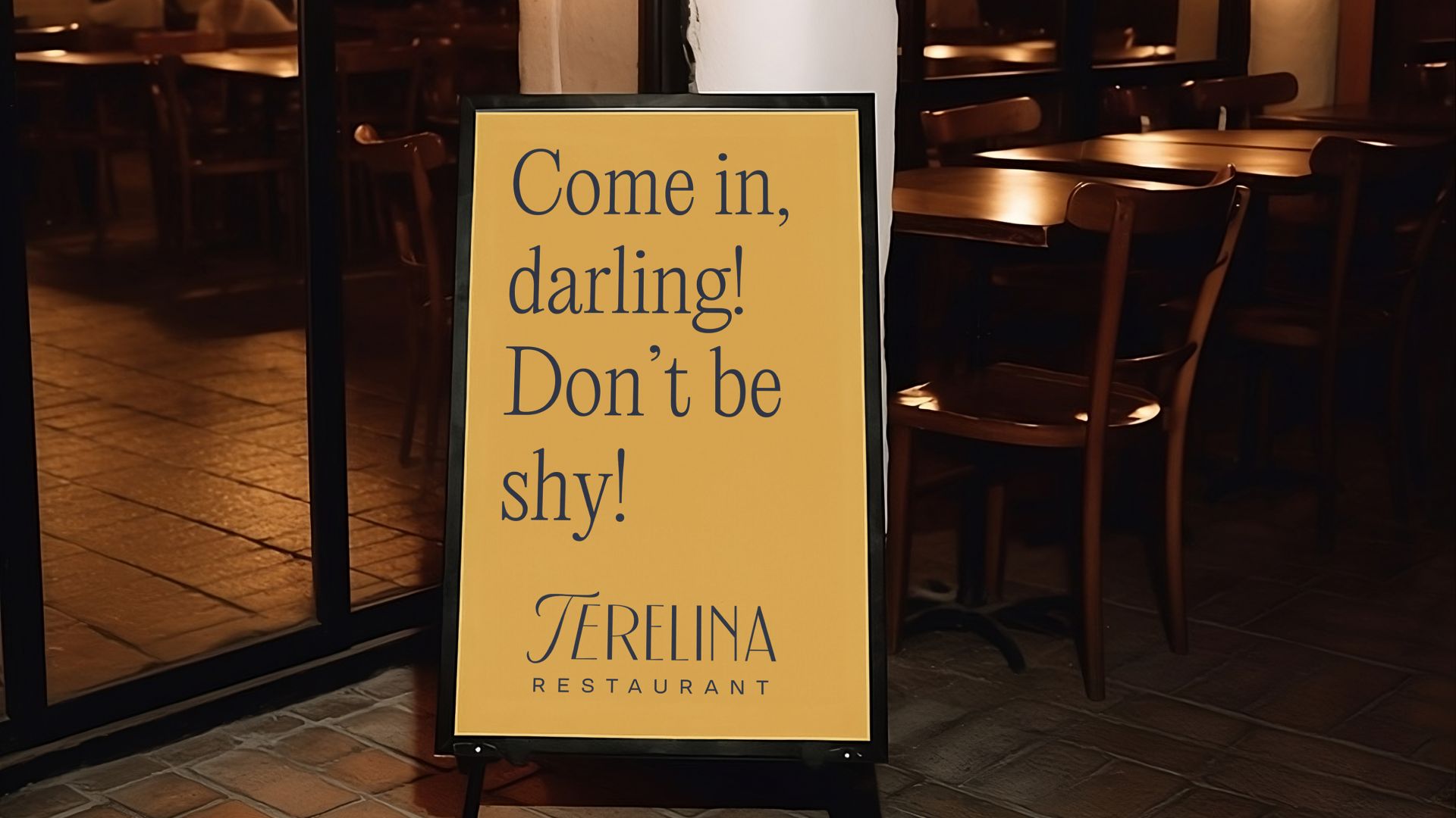
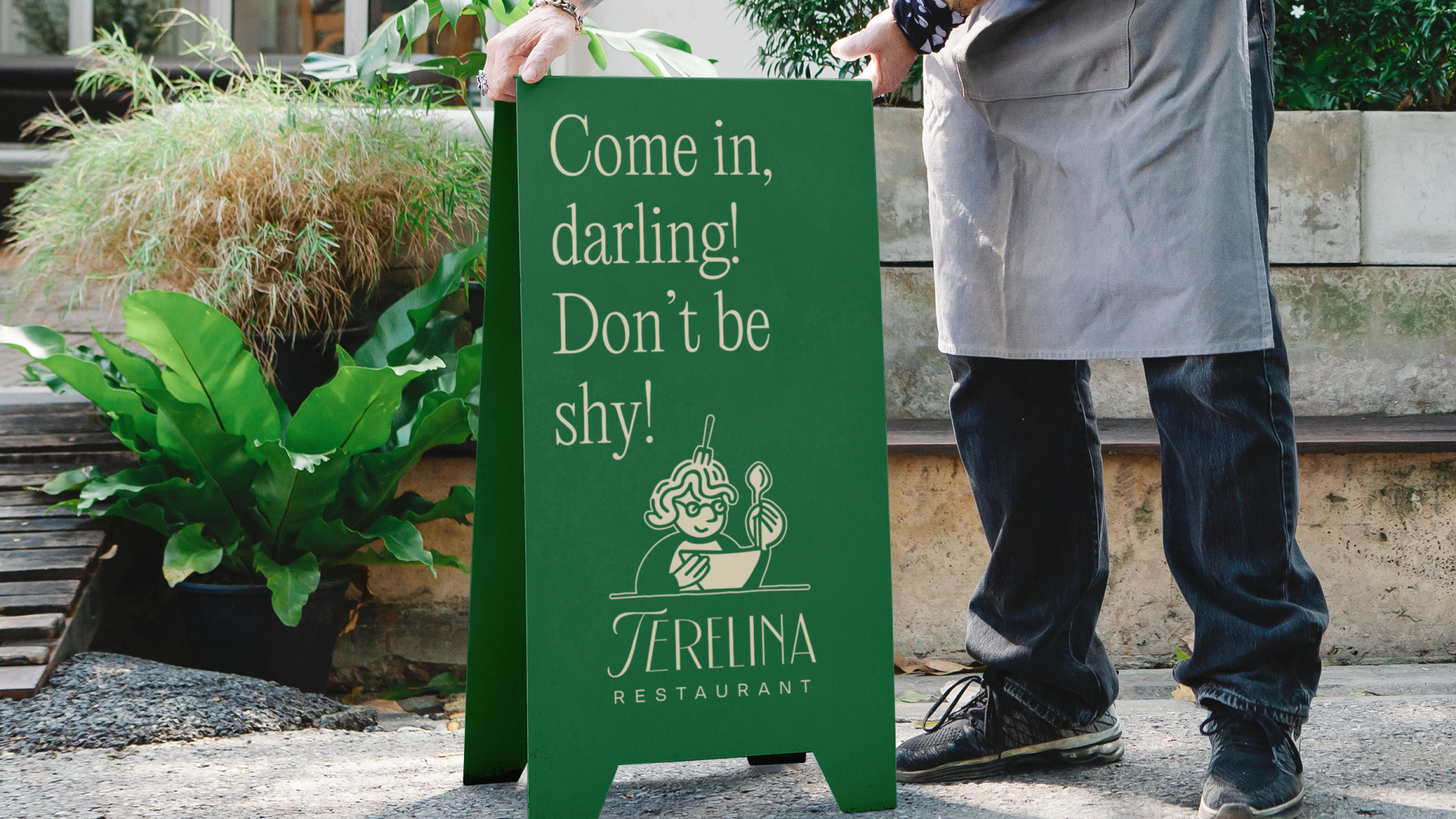
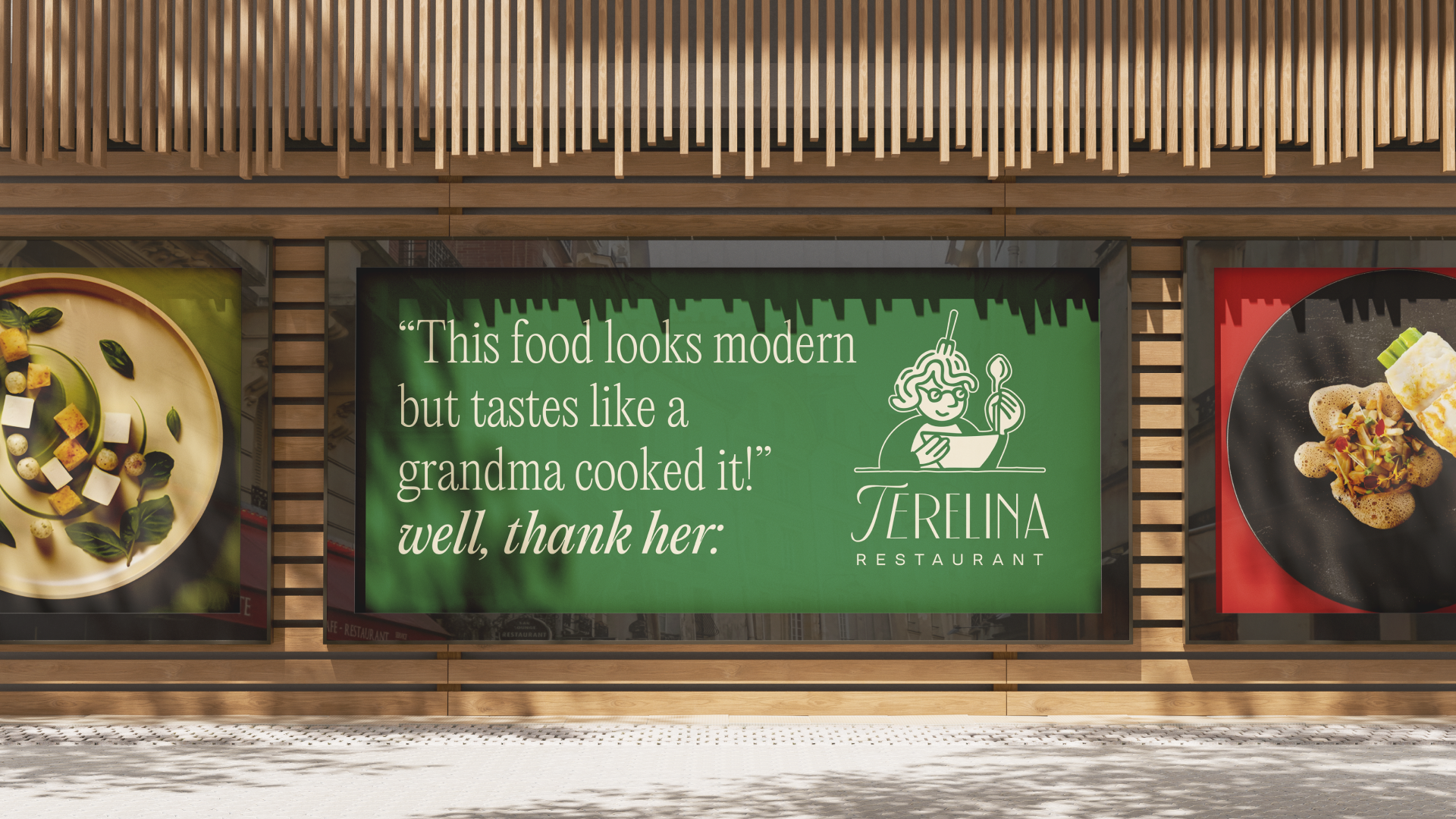
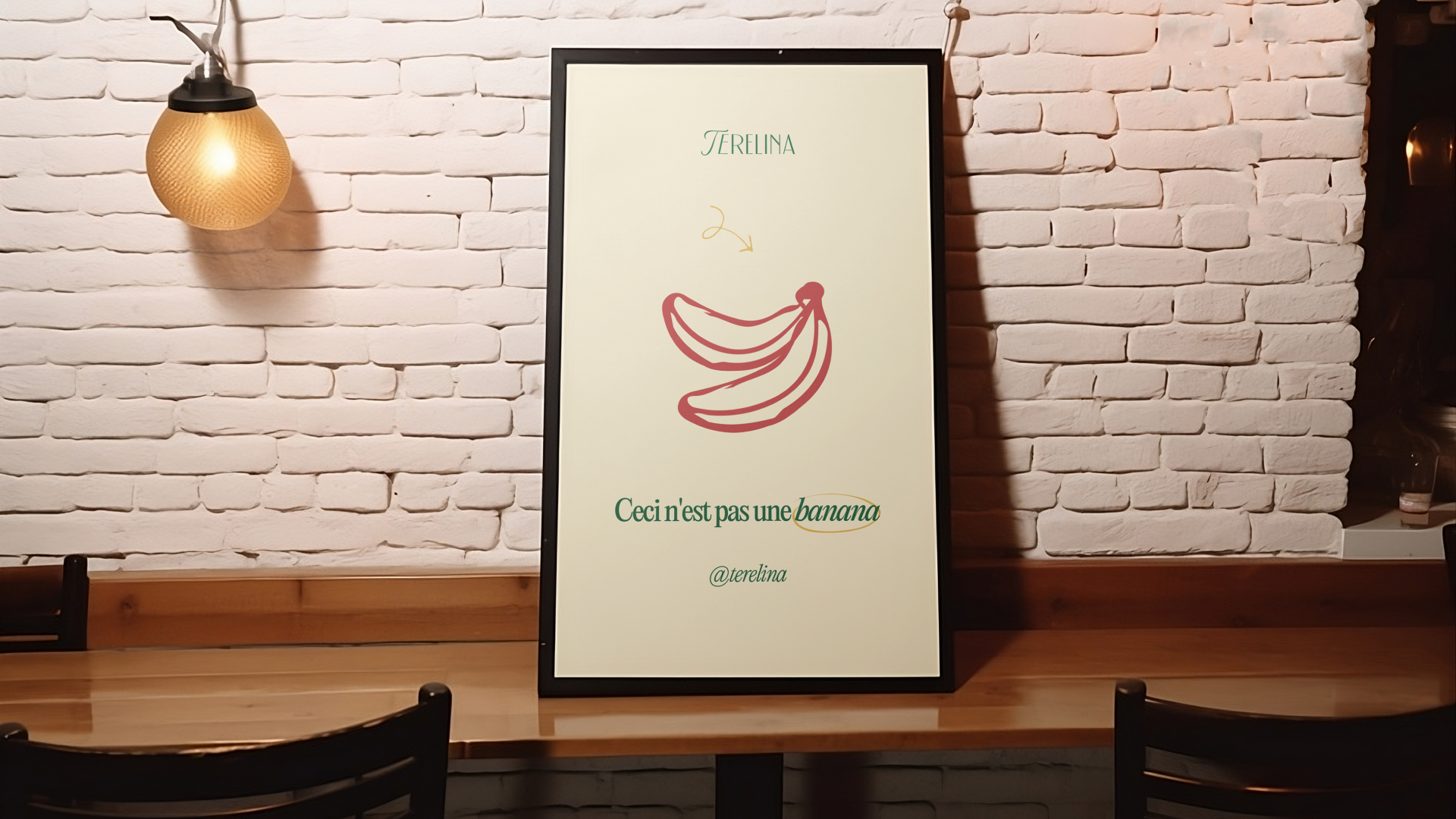
Ao desenvolver a identidade visual do Terelina, nos concentramos na elegância contemporânea, mas deveria uma marca atemporal. As linhas limpas e minimalistas refletem a sofisticação da alta gastronomia, enquanto elementos surreais e coloridos, como pinturas a óleo e desenhos esdrúxulos feitos a mão, fazem alusão à arte brasileira e renomada de Tarsila do Amaral. O Terelina agora está pronto para se destacar como um destino de alta gastronomia em Lisboa, unindo o melhor da cultura brasileira e italiana em cada prato.
_
EN
Terelina - A Brazilian and Italian Fusion in Fine Dining
We are delighted to present our branding project for Terelina, an Italo-Brazilian restaurant set to open its doors in Lisbon soon. The name "Terelina" pays tribute to the grandparents of the partners, representing the family essence and culinary tradition at the heart of this venture.
We are delighted to present our branding project for Terelina, an Italo-Brazilian restaurant set to open its doors in Lisbon soon. The name "Terelina" pays tribute to the grandparents of the partners, representing the family essence and culinary tradition at the heart of this venture.
The chosen colors to compose the visual identity of this project were drawn from pastel tones, representing the two referenced nations. On one side, yellow, green, and blue, representing Brazilian diversity, on the other, red, white, and green capturing the traditional Italian essence. The off-white beige tone comprises the majority of Terelina's visual identity.
While developing Terelina's visual identity, we focused on contemporary elegance but aimed for a timeless brand. Clean and minimalistic lines reflect the sophistication of fine dining, while surreal and colorful elements, such as oil paintings and whimsical hand-drawn designs, allude to Brazilian art, particularly the renowned works of Tarsila do Amaral. Terelina is now poised to stand out as a destination for fine dining in Lisbon, blending the best of Brazilian and Italian culture in every dish.
_


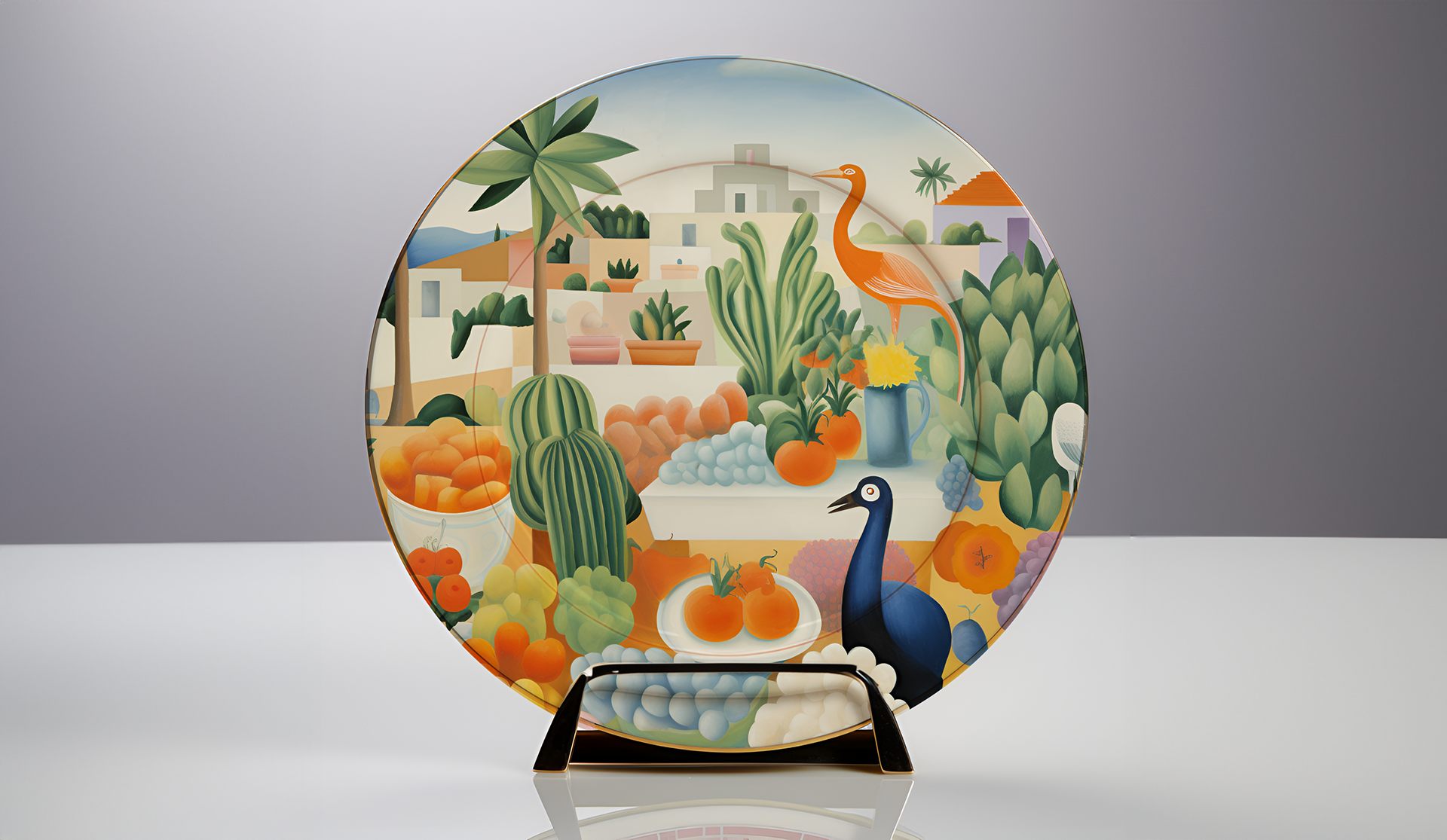
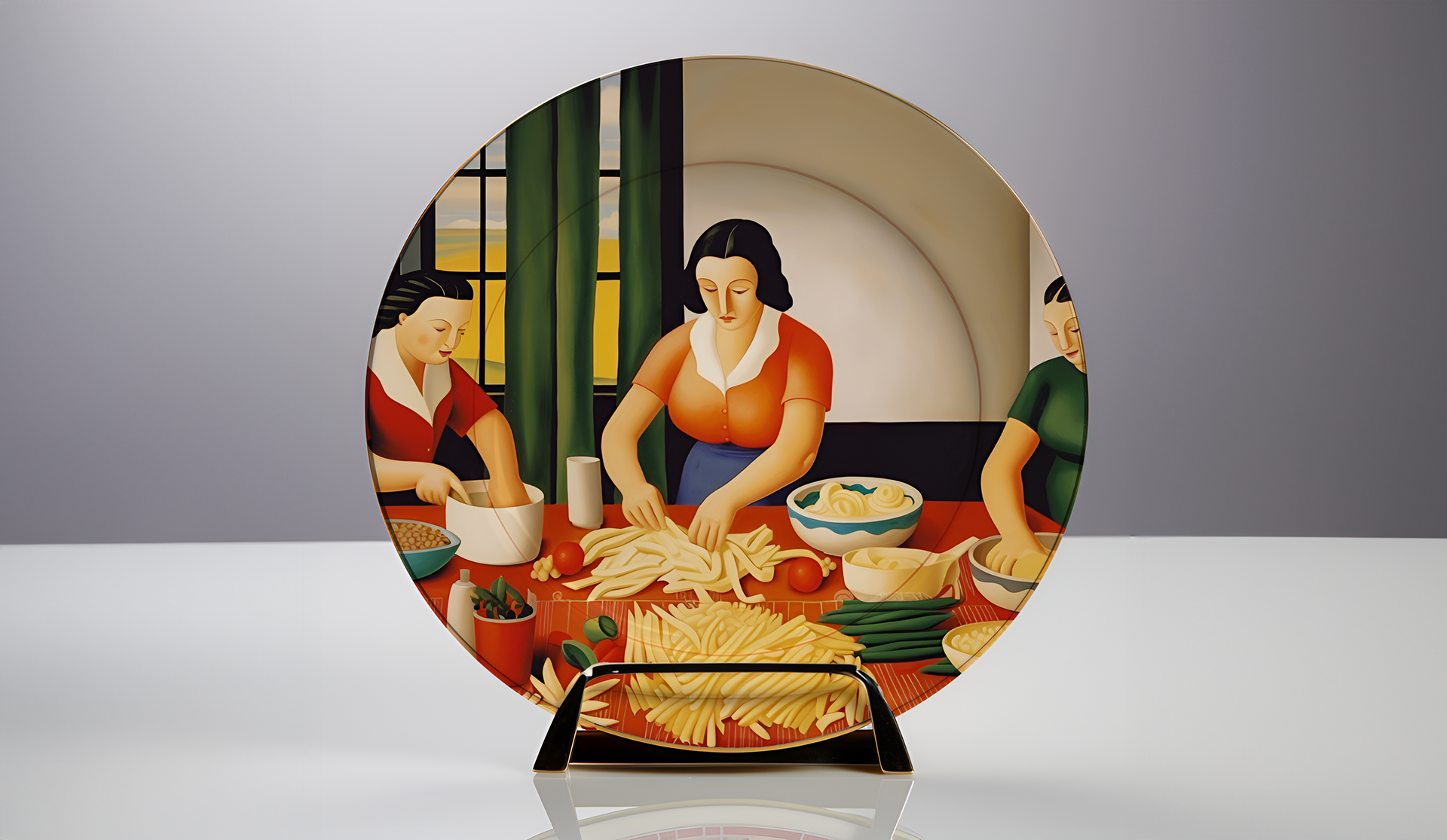
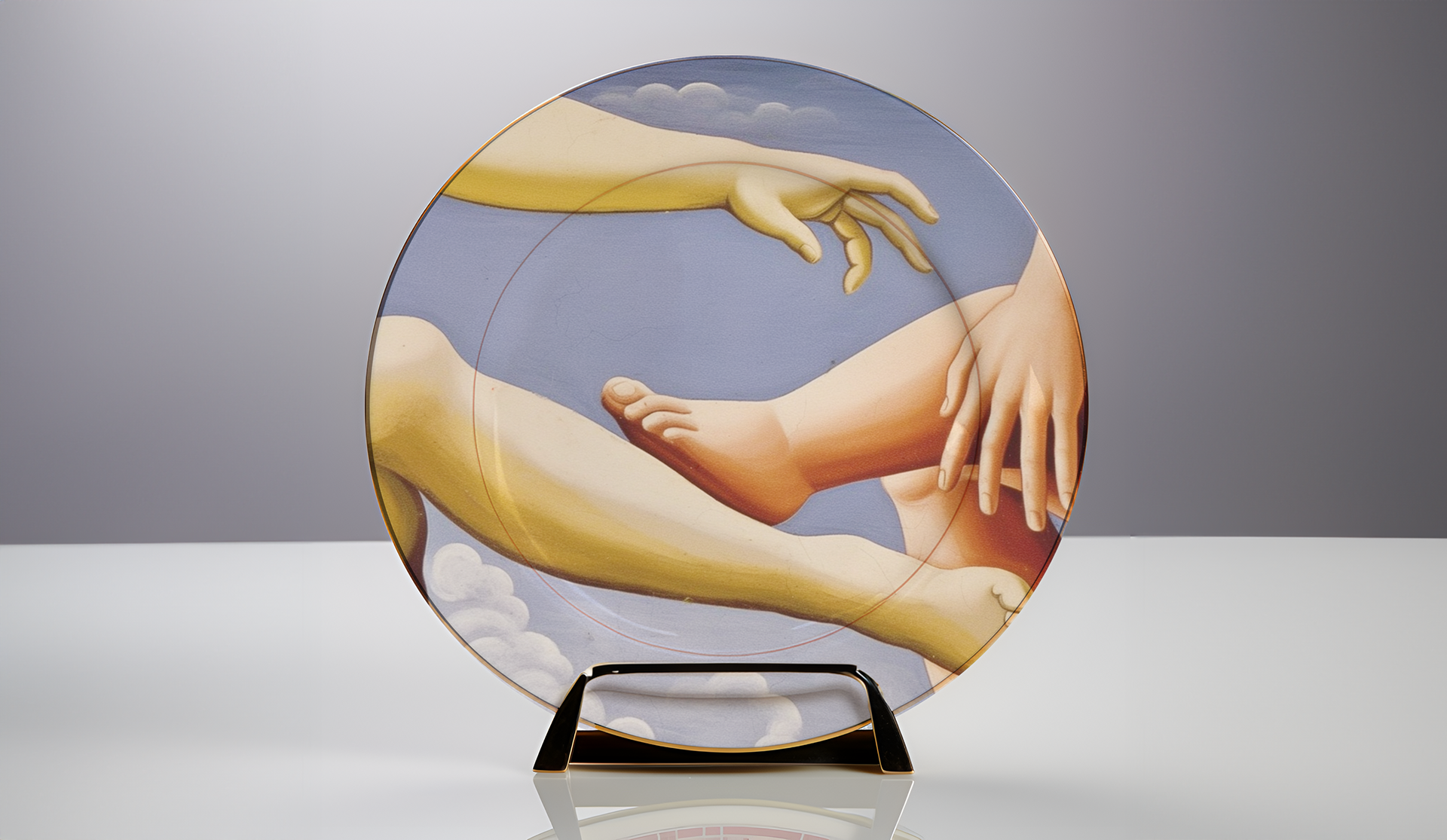

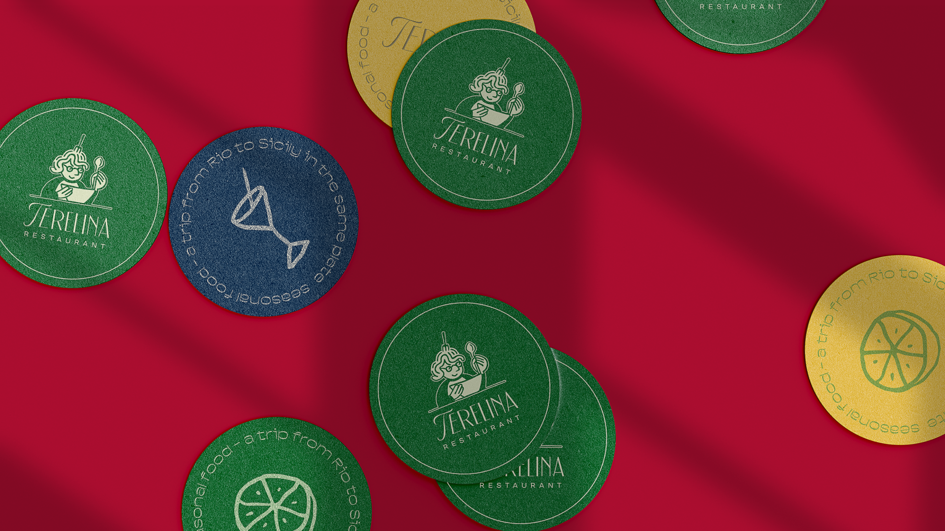

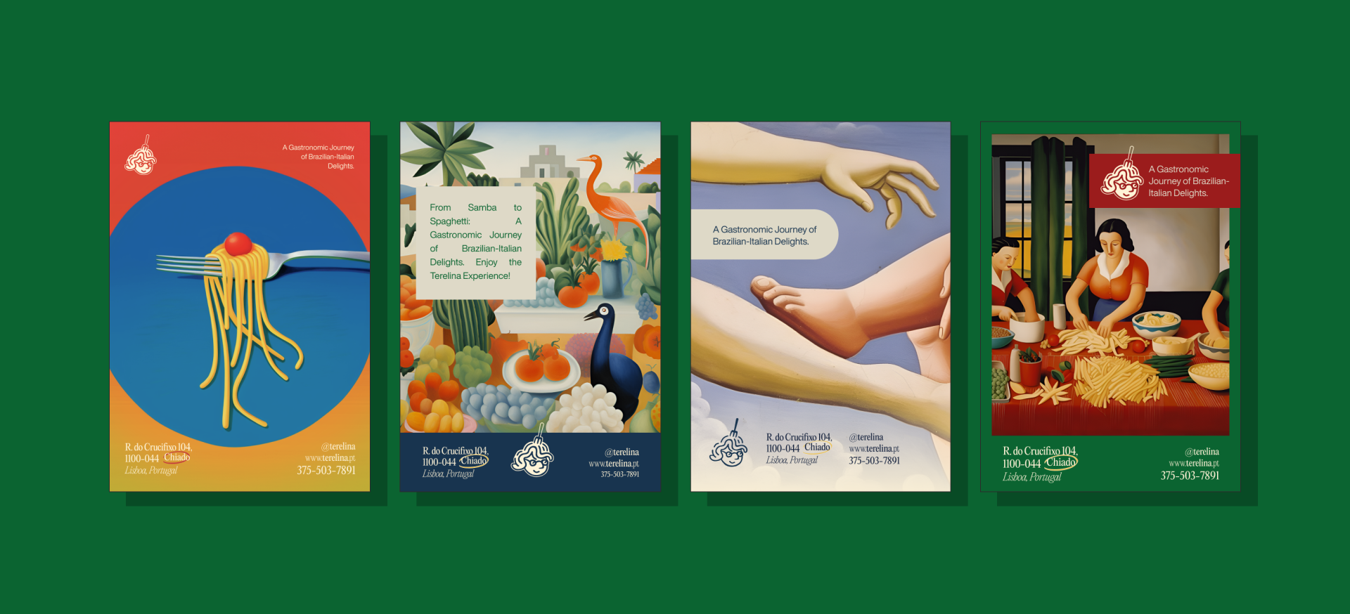

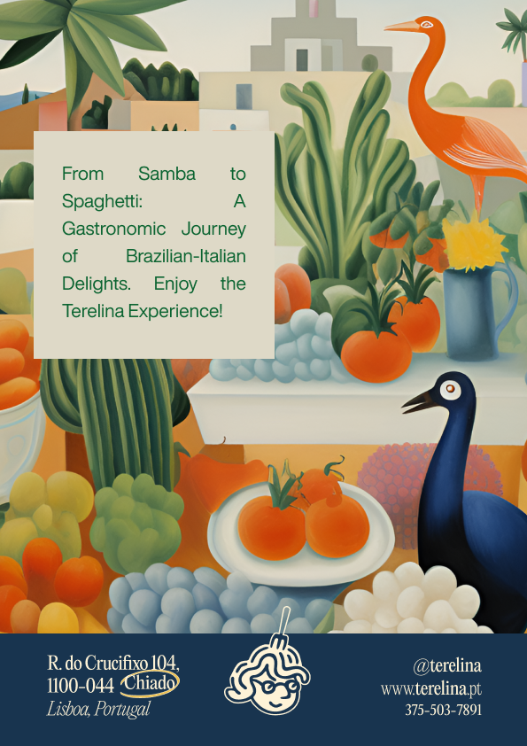

Criamos diversas obras de arte digitais que exploram a ideia de uma "Releitura" feita por Tarsila do Amaral sobre clássicos visuais tanto italianos quanto brasileiros. Nossas criações fundem elementos de pinturas icônicas, ingredientes tradicionais e paisagens emblemáticas de ambas as culturas. Essa abordagem única adiciona uma camada de profundidade à experiência Terelina, permitindo que nossos clientes mergulhem em uma jornada sensorial que une passado e presente, Brasil e Itália.
We have also crafted various digital artworks that play with the concept of a "Reinterpretation" by Tarsila do Amaral of visual classics from both Italian and Brazilian traditions. Our creations blend elements from iconic paintings, traditional ingredients, and emblematic landscapes of both cultures. This unique approach adds an extra layer of depth to the Terelina experience, allowing our customers to embark on a sensory journey that bridges the past and the present, Brazil and Italy.
We have also crafted various digital artworks that play with the concept of a "Reinterpretation" by Tarsila do Amaral of visual classics from both Italian and Brazilian traditions. Our creations blend elements from iconic paintings, traditional ingredients, and emblematic landscapes of both cultures. This unique approach adds an extra layer of depth to the Terelina experience, allowing our customers to embark on a sensory journey that bridges the past and the present, Brazil and Italy.
PT - BR
Este foi mais um projeto realizado por nós da Visant Studio!
Entre em contato através do link abaixo e solicite um orçamento, será um prazer atender você.
-
EN
And this wraps up another successful project done by us at Visant Studio!
Contact us through the link below, it will be a pleasure to work with you! Our team is also 100% fluent in english.
-
Pedro Xavier & Pedro Jaques
Pedro Xavier & Pedro Jaques